The Autark Tourbillon is a living project and it has already proved to be such with continued communication around new dials and future strap positions. The very first images leaked of this project were of the Gradient Grey dial with Power Reserve. The image of this dial started circulating and we are thankful for that as it helped generate feedback from the watch community.
It all started with Gradient Grey accompanied by a Power Reserve Indicator
Were we on the right path or did we need something extra?
The community spoke and asked for a non-power reserve version, additional colour options and a dial pattern. The team here at Horage looked to powerful deep blue and black dials that would match well with the three-movement colours of anthracite, blue and red. To add some more depth to the dials we introduced a sunray pattern on both blue and black options.


Hitting milestones is important for us as they validate reasoning for introducing new options to the collection. Adding new options comes at a cost in production and in watchmaking the costs are very high. From our retailers to those messaging us, we had garnered many requests for additional dials. One such request was for a salmon dial a colour we have never offered before. At first, we were hesitant, but as we began looking at this dial we realized the Autark Tourbillon was the watch to bring the opulent look and feel of a salmon dial to life.
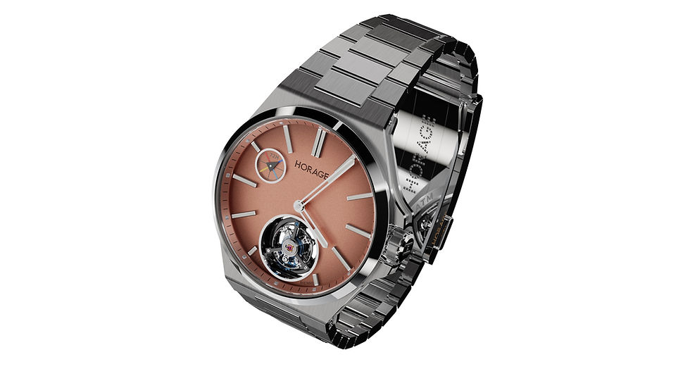
Close up texture details of the new salmon dial
Last week we announced the new salmon dial option for the Autark Tourbillon on our YouTube Livestream. The response has been very positive with many enthusiasts placing new orders, additional orders or changing their original dial option to salmon.
Andi, David and Landon Live on YouTube, be sure to join them next Thursday December 21st @18:00 CET
This hue varies widely by brand, from varieties of pink and rose to many in between. Some shades of dials from other brands tend to fall flat with little depth or liveliness (a dead salmon, if you will), but we focused intently on creating a unique shade for our most luxurious piece to date (notwithstanding the very limited Yi diamond watch). We can't spill the beans on the entire process, but it involves sandblasting and the addition of a very fine black nanostructure to create a more dynamic, "living" salmon hue.

Salmon tends to be a uniquely difficult colour to master as again shades and hues vary widely. Consistency is challenging when dealing with relatively low production and a lot of handwork. The challenge is worth it in the end as salmon dials continue to represent the ultimate in luxury and it's a very fitting addition to the Autark Tourbillon.

Salmon without Power Reserve indicator
Salmon with Power Reserve Inidicator
Both salmon and blue dial timepieces breathed new life into luxury timepieces at their inception. Let's take a step back in time and look at their origins.
There's a lot of interest in dial elements and complications. Tourbillons, power reserves and so on are visually very interesting. But, what about the base dials themselves? Colours and textures can be a lot more difficult to perfect than expected. Sunray patterns and even sandblasted finishes often involve a three-dimensional approach to create a one-dimensional finished product. Dial colours should never be underestimated; they can sometimes make or break a watch. Let's look at two of the most popular colours in luxury watchmaking, blue and salmon, and how they have risen in popularity.
A nighttime look that is sure to catch one's eye.
Early pocket watches most likely and often had German silver dials, while enamel dials appeared in the 17th century. White and silver dials were generally the most common, but even early enamel examples could be very intricate with patterns or imagery containing multiple colors. For example, enamelled scenes with ships or horses added a significant premium to early pocket watches, while such elaborate displays are more of a rarity today.
The Power of Blue
Wristwatches changed the game in the 20th century with smaller dials that were never tucked away in a pocket or (rarely) covered by a lid. As the segment matured, legendary pieces emerged that started lasting trends with both dial colours and patterns. As interest in wristwatches grew so did the various dial colours, patterns and complications. There are some notable examples such as the original blue dial Royal Oak with its petite tapisserie pattern. The combination of colour and texture helped define it as a luxury timepiece. It's largely credited with the onset of blue dial popularity since its launch in 1972. It's not alone, however, as another icon surfaced a few years later.

Patek Philippe ref. 5811 - Source Hodinkee
In 1976, Patek Philippe launched the Nautilus, another integrated sports watch from the mind of Gerald Genta (he designed both the Royal Oak and Nautilus). Patek went with a blue dial on the inaugural piece, this time with an embossed pattern of horizontal lines. Both the Royal Oak and Nautilus patterns added visual sophistication to otherwise plain dials and the blue dials against steel cases became all the rage. Even today, blue is among the most popular dial colours and is often associated with luxury, and our new Autark Tourbillon, Tourbillon 2 and Supersede Date have blue dial options with sunray patterns or a lined pattern (Livre de Durrow) for the Tourbillon 2.
Deep and rich blue accentuated by the sunray pattern
Salmon -The Ultimate in Luxury
As popular as blue has become in the luxury space, no colour seems to define opulence and desirability more than salmon. It's a craze initiated by Patek Philippe, although not intentionally at first. Gold cases went well with pink(ish) dials for a tone-on-tone look (particularly rose gold), so the matching aesthetic was more about consistency than a distinctive dial hue. It was the contrast of pink hues and silver cases (steel or white gold) that created the "salmon" dial.

Patek Philippe Ref. 130 - Source A Collected Man
Rolex was an early pioneer with a small handful of salmon dials in steel cases in the early 20th century. In the mid-20th century, salmon dials became more common, although watchmakers generally didn't use that term. It seems to be a relatively recent word by collectors to describe the dials. At the time, almost all luxury watchmakers outsourced their dials to specialized manufacturers, so an increase in salmon dials is likely a result of the dial makers pushing the colour.

Rolex Chronograph dial - Source A Collected Man
Back to Patek Philippe, salmon dials were usually made at the request of clients in lieu of standard production, making vintage models very rare and prized by collectors. This creates a perception of value with the salmon hue, so it's become a symbol of luxury for watches and we can thank Patek Philippe. They don't deserve all the credit, however, as Rolex, Audemars Piguet, Longines and others have vintage salmon dials that are very rare today. The colour comes in many shades and subtleties, and technology has allowed even small microbrands to capitalize on the colour today. However, achieving this colour with a perfect hue and depth is surprisingly difficult and luxury brands handle this differently than small, affordable ones. For example, some traditionalists make alloys of copper and gold to create the perfect colour. It falls into five categories with 1N being champagne, 3N being salmon and 5N being red gold (2N is yellow gold and 4N is pink, often referred to as salmon as well).

Galvanoplasty turns brass dials to silver. This silver finish helps breathe life and depth into Salmon dials - Source A Collected Man
Today, many salmon dials (and most colours) are achieved via galvanoplasty (or electroplating), which involves a bath of chemicals and provides great consistency to a large number of dials at a time. Most, such as the brands listed above as well as ourselves utilize the galvanic process, but some outliers go for the aforementioned gold process (most likely 4N). PVD, enamel, paint and other methods are also used for salmon dials and, of course, other colours as well. Salmon dials are fairly rare, but the horological connoisseurs seek them out and continue to drive their popularity.
What's your take?
Are you changing things up to salmon?
The salmon dial options of power reserve or no power reserve are configured with the anthracite movement colour. If you have already ordered and would like to change to salmon simply send us a note to lostintime@horage.com please include your order number and your full name.

Salmon dial with Power Reserve Indicator

Salmon dial without Power Reserve indicator
What's your favourite spec so far of the Autark tourbillon?

Sunray Black dial with Anthracite movement

Sunray Black dial with Blue movement

Sunray Black dial with Red movement

Sunray Blue dial with Anthracite movement

Sunray Blue dial with Blue movement

Sunray Blue dial with Red movement

Gradient Grey dial with Anthracite movement

Gradient Grey dial with Blue movement

Gradient Grey dial with Red movement
Let us know your picks and thoughts on our new salmon offering in the comments!
Erik Slaven & Landon Stirling
The salmon, or perhaps the blue sunray (with red movement plate) are the best of the bunch, IMHO. The salmon appears to have a bit of a fume effect as well? Would love to see some pics of the dials IRL, not CG. Any made yet?
Hi Landon, love this! I have a suggestion for the Horage logo on the dial, can I reach you by email?
Just read about the Chopard L.U.C 1860 Salmon Dial with micro rotor and 64 hrs power reserve. Very elegant! https://www.chopard.com/en-gb/watch/168860-3003.html
Now, I really need to "see" my Horage Autark TMR in Salmon dial in a prototype product.
I think there should be a grey dial without power reserve.
It'd be the ultimate minimalist look many would love
Bold and bright is my preference!
Kudos on offering so many options on this watch. Pretty unheard of even on pre orders.
Didn't know salmon was harder to make than other colors. Is that for pink as well? Even tho' I live in B.C. and sometimes catch a chinook for homemade sushi, I'll take pink over salmon for my dial.
The Blue on blue or black and red movement look like the best of the images, IMHO.
I'm perpetually torn on the PM. I really like it on my GS watches, but took time for me to appreciate
I'd leave it off the Autark KTMR I think? Ask me in 10 min and I might've changed my mind 🤪
The salmon dial is an improvement (black, blue and grey are nonstarters in my book) you could make it even better by offering heated blue hands and indices. The image of the Patek Phillipe in the post demonstrates nicely how blue and salmon work together.
I'm glad that you have seen an uptake of new orders since offering the slamon dial. I'd need to see some more substantial changes to convince me to place an order (e.g. a media blasted case, knurled bezel and green brushed steel/carbon fibre/full lume dial). Looks like I'll have to wait a few years to see if/what future releases of Autark Tourbillon wil offer.
Money/dark green dial please! Maybe with some gradient.
Not to be a know-it-all or anything, but isn't the front view showing the grey movement at the 10-11 o'clock position of the tourbillon cage for all of the above?